


Der Verlauf, den ich Euch vor einiger Zeit mal gezeigt hatte, war ja nur ein Test für die Hochzeitskarte einer Kundin. Nun darf ich Euch auch die entsprechende Karte dazu zeigen.
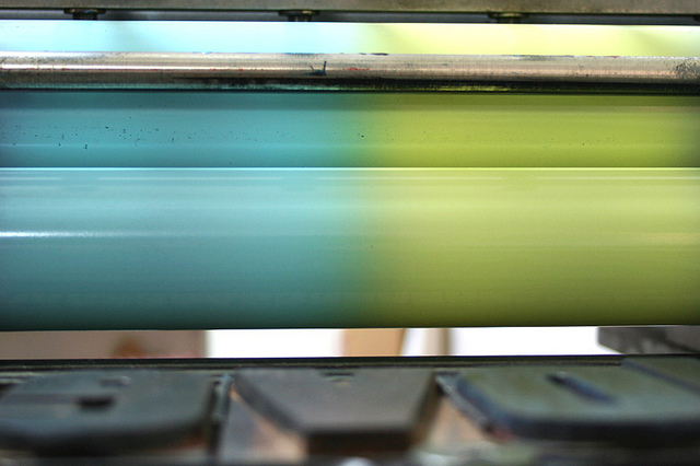
Die Zeichnung und die Gestaltung der Hochzeitskarte hat Andrea selbst gemacht und wie ich finde, ist ihr das super gut gelungen. Der Verlauf enstand dadurch, dass ich links blau und rechts gelb auf die Walzen der Korrex aufgetragen habe und in der Mitte beide Farben, so dass sie sich zu türkis vermischen. Die Schrift wurde dann später eingedruckt. Für mich war das absolutes Neuland, aber mir hat es so gut gefallen, dass ich nun bei meinen neuen Projekten jedesmal überlege, ob sich ein Verlauf anbieten könnte. Bislang hat es leider noch nicht gepasst, aber seit letzter Woche habe ich eine Idee. Mal sehen …
——–
Back in April I was asked by a client to do a gradient. Maybe you remember my test prints. Now this is the final card that came out of the project. A colourful summerlike wedding card. Andrea did the drawing for her wedding card and the design all by herself. Fantastic job I’d say.
I’ve done the printing on my proof press, placed the two inks separate on both sides of the rollers and let them overlap in the middle. It was so much fun that I now consider a gradient for every new project that comes to my mind. So maybe this card is the start for an experimental printing series. Interesting how custom jobs can push you in a direction without knowing.